What This Document Is
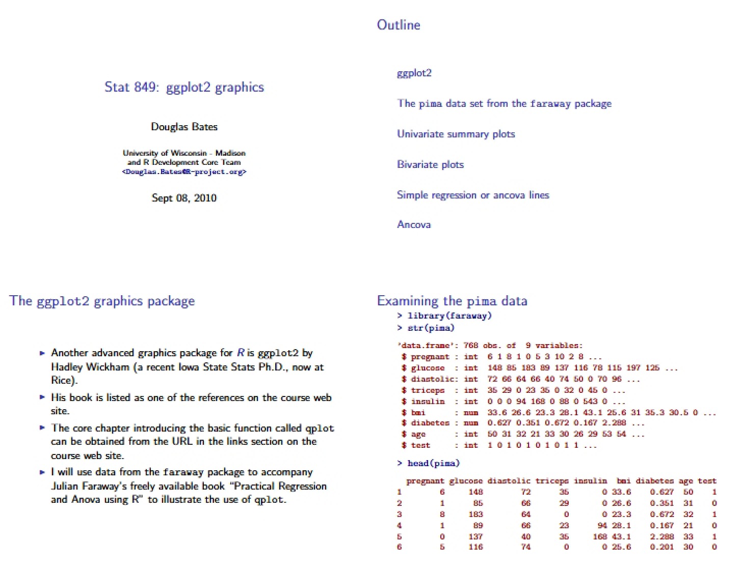
This is an introductory chapter focusing on a powerful visualization tool within the R statistical computing environment. Specifically, it explores the ‘qplot’ function from the ‘ggplot2’ package – a system designed for creating a wide range of graphical representations of data. It serves as a foundational guide to understanding the principles behind data visualization using this particular framework, setting the stage for more complex plotting techniques. The material assumes a basic familiarity with the R programming language.
Why This Document Matters
Students enrolled in statistical methods courses, particularly those focused on regression and analysis of variance, will find this resource invaluable. It’s ideal for anyone needing to effectively communicate data insights through compelling visuals. This chapter is most beneficial when you’re first learning to implement data visualization techniques in R and need a clear starting point for building plots. It’s also helpful for those transitioning from base R plotting functions and seeking a more structured and flexible approach. Understanding these fundamentals is crucial for accurately representing and interpreting statistical results.
Common Limitations or Challenges
This chapter provides an introduction to the ‘qplot’ function and the underlying grammar of graphics. It does *not* offer an exhaustive exploration of all possible plot customizations or advanced features within ‘ggplot2’. It focuses on establishing core concepts and building a foundational understanding, rather than providing ready-made solutions for every visualization scenario. Furthermore, it assumes access to the ‘ggplot2’ package and a basic working knowledge of the R environment.
What This Document Provides
* An overview of the ‘qplot’ function and its relationship to traditional plotting methods in R.
* Guidance on mapping data variables to visual characteristics (aesthetics) within plots.
* An introduction to different geometric objects (‘geoms’) used to create various plot types.
* Explanation of how to divide data into subgroups for separate visualization using faceting techniques.
* Discussion of basic plot appearance adjustments and options.
* A comparison of key differences between ‘qplot’ and base R plotting functions.
* Introduction to example datasets used throughout the chapter for demonstration.