What This Document Is
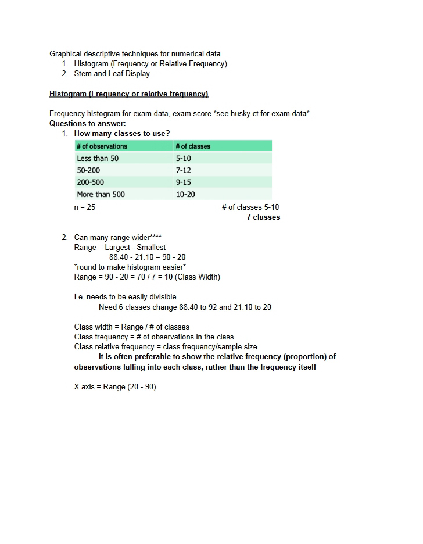
This resource is focused on foundational techniques for visually representing and summarizing categorical data – information sorted into distinct groups or categories. It’s designed to help students understand how to organize and display data in ways that reveal patterns and distributions. The material centers around three common graphical methods used in introductory statistics, building a strong base for interpreting data encountered in various fields. It specifically uses an example dataset related to exam performance to illustrate these concepts.
Why This Document Matters
This is a valuable resource for students enrolled in introductory statistics courses, particularly those who are new to data visualization. It’s most helpful when you’re learning about descriptive statistics and need to understand how to choose the appropriate method for presenting categorical information. Students preparing for quizzes or exams on data representation will find this particularly useful as a refresher and a way to solidify their understanding of core principles. It’s also beneficial for anyone looking to improve their ability to interpret charts and tables commonly found in research reports and news articles.
Topics Covered
* Frequency Tables: Constructing and interpreting data summaries.
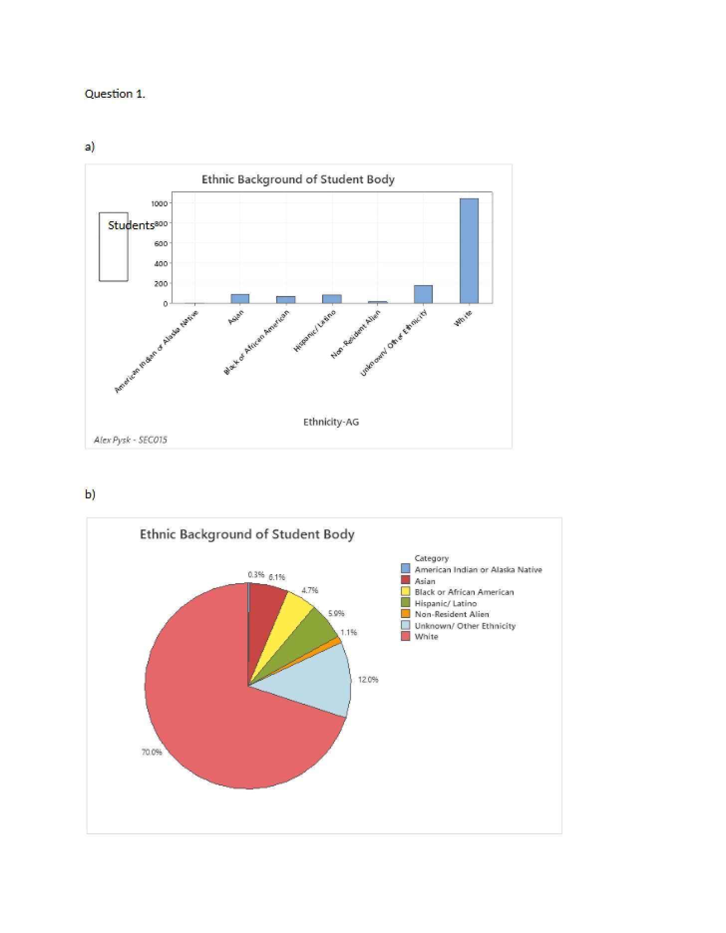
* Bar Charts: Visualizing data using rectangular bars.
* Pie Charts: Representing proportions of a whole.
* Relative Frequency: Understanding percentages and proportions within a dataset.
* Data Representation: Choosing the best visual method for categorical data.
* Sample Size: The importance of total observations in calculations.
What This Document Provides
* An overview of three key methods for displaying categorical data.
* Illustrative examples using a specific dataset (exam grades).
* Explanations of how to calculate key values used in data representation.
* Guidance on interpreting the visual displays of categorical data.
* A focus on ensuring accuracy and completeness in data presentation.